Camunda

Camunda: A brand as a scalable asset
Camunda provides a workflow and decision automation platform offering process orchestration capabilities to organizations of any size. The Camunda Platform comes from years of research and development, including open-source initiatives.
When I joined Camunda, the company was around 100 people. I collaborated with the SLT and Marketing team to create a new global identity, launching it during the FY2020 kick-off. Drawing inspiration from heavy industry and contemporary tech design trends, I devised a stamp logotype, color palette, and brand standards, which we then implemented across the organization.


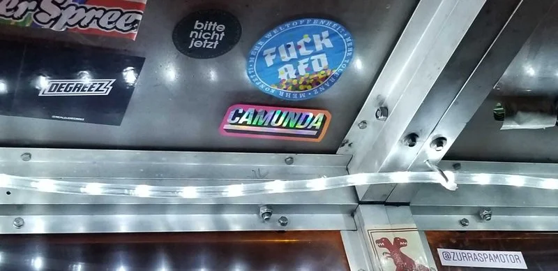
A coherent whole leaves a stronger impression than disparate whimsy. The centrepiece of the brand was a bold industrial stamp logo. Simple and memorable.
Alongside the simplified halo brand, we created engaging animations and giveaways that helped staff and customers embrace the most significant shift in Camunda’s branding since its founding.
Consistency as an aesthetic
From $100m series D to $100m ARR
It was a transformative period for the business. In 2021 Camunda secured a $100M Series D funding round, and today the company has surpassed $100M ARR.
The work did helped make a complex brand more consistent, modern all while maintaining the bootstrapped ethos of the company. The experience was incredibly rewarding, and I was thrilled to see the brand come to life - and to watch the company grow into one of Europe’s leading enterprise software scale-ups.

